
What a Useful Marketing Dashboard Actually Shows
This post originally appeared in my Substack newsletter, The Work Behind the Work. Subscribe here.
You will find the same sort of dashboard at most companies, put together once a year or so. It is an automated affair with its own color scheme and a link for leadership, accompanied by some words on transparency. There it sits: impressions, reach, engagement, follower growth, email opens, click-throughs, web sessions, time on page, form fills – all live in one spot.
And then no one looks at it.
One might ask why leadership is so disengaged, but the better question is what the thing was for to begin with. It wasn’t broken; it was just fielding questions that had never been put to it.
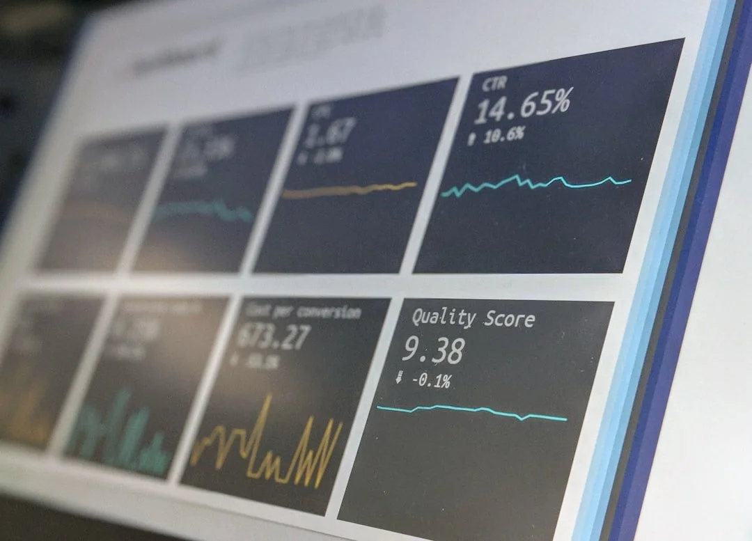
Photo by Stephen Dawson on Unsplash
One might ask why leadership is so disengaged, but the better question is what the thing was for to begin with. It wasn’t broken; it was just fielding questions that had never been put to it.
I know from experience. I didn’t have a live feed, I had an annual report on which I put in weeks of work. Follower growth on every channel, impressions, the year-over-year comparisons, all formatted with charts you can be a bit proud of. Every glamorous number digital marketing has to offer was there, delivered on time.
Not a soul read it. Not out of any refusal on their part – it was out there for them – but it simply never came up. No pushback, no questions. A little disagreement would have been preferable to the polite nothing I received.
What I came to understand was that I had written a report on marketing for people who wanted to know about the business. The figures were right enough – how much we put out, how many saw it or clicked on it – but they did not tell leadership what any of it meant for the company. I had made the error of building from what I could measure rather than what needed proving. Now I start at the other end and work my way back. It is a slower process and yields a shorter document.
The test I use now
The test I apply is simple: every number on a dashboard must be tied to a decision. Not a feeling or some vague sense of progress, but an actual decision that would be made differently if the figure moved one way or another. Put your own reporting to the test. Pick a metric and complete the thought: “If this drops for two months running, we will …”
If you are stumped, it is not information. It is decoration. It is uncomfortable to admit, but we let a lot of metrics live because they are easy to track. Impressions are convenient to put on a slide. But when a number cannot alter a course of action it is a cost in itself, consuming the limited attention of your leadership and putting out the numbers that should matter.
Two audiences, two dashboards
Then there is the problem of trying to serve two audiences with one creation. Leadership wants to see if demand is up, if the pipeline is being fed, if there is a trend worth a conversation. Five or six numbers, the same ones each month so the pattern is clear. Your team needs the working data, the diagnostics – which subject line worked, where the drop-off was. That is messy by design and changes week to week. Combine them and you have something that will overwhelm the executives and do the team no favors. Everyone will nod and nobody will use it.
Better to have an executive view short enough to be read standing up, and a team view honest enough to be a little uncomfortable.
What the good version has
There are three things in common with the dashboards that actually see use.
They put the question first. The header doesn’t say “Social Performance,” it asks whether our audience is growing in the right segments, and the chart is merely the answer.
They provide direction, not just a position. 4.2% engagement tells you nothing until you see it was 2.8% in March.
And the best reporting I have put forward has been the kind that concedes what it can’t see. I have found more trust in admitting a piece of inbound demand has no source than in any chart. To pretend attribution is clean is to have your numbers disbelieved.
The subtraction exercise
If your reporting has gone off the rails, don’t go in and redesign it. Delete from it. Print it off and cross out anything you can’t justify with a decision. You will be left with four or six items in twenty minutes. It will look thin and you will have the urge to add to it to make it seem like more work. Resist that; it is the very impulse that creates the unreadable version.
A dashboard is supposed to be an instrument for deciding what to do next, not proof that marketing has been busy. Too many are the latter in disguise.
I am curious: name a metric you have been tracking for months that has never once altered a decision. Reply with it or leave it in the comments.
